Designing for the “Six-Foot” Rule
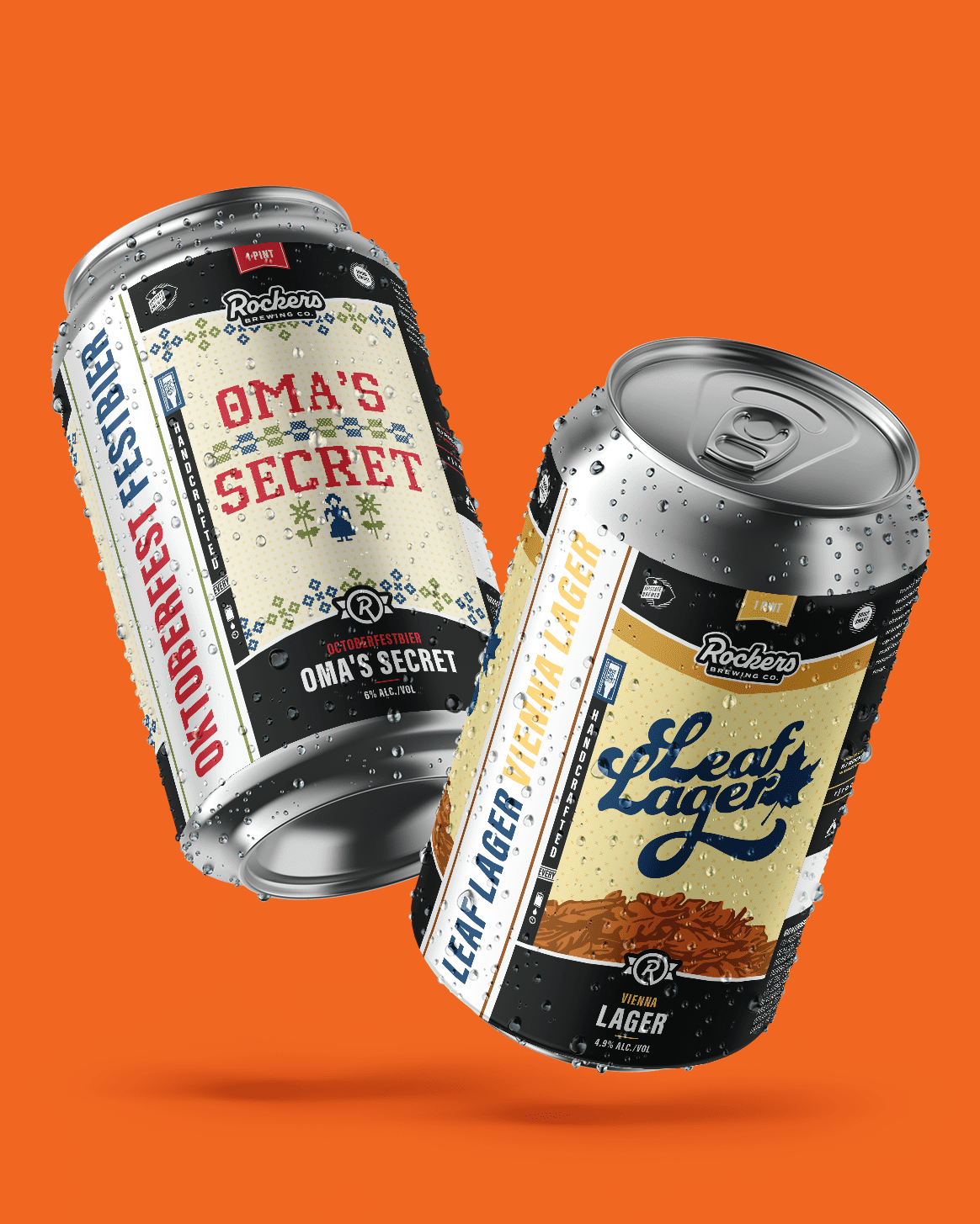
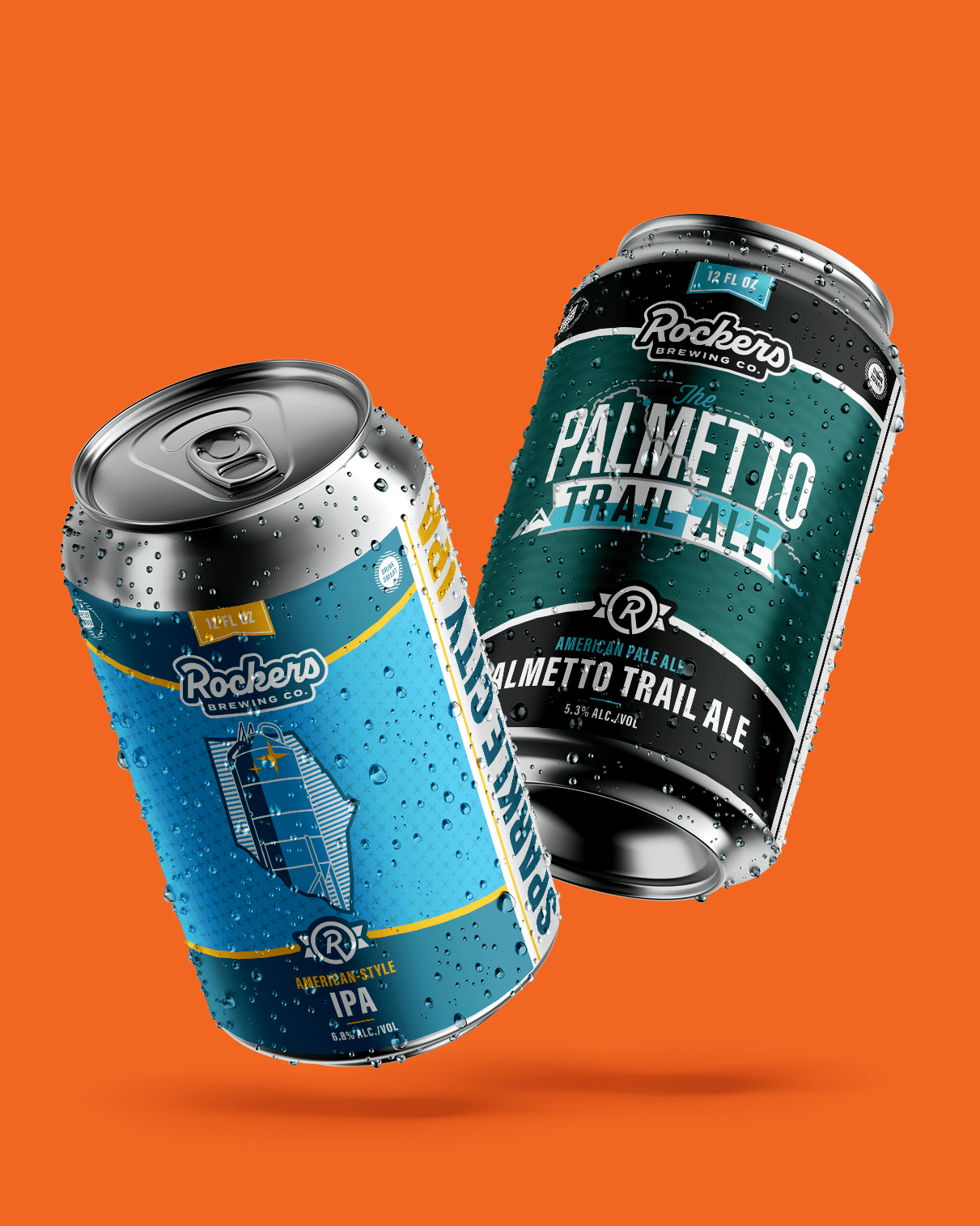
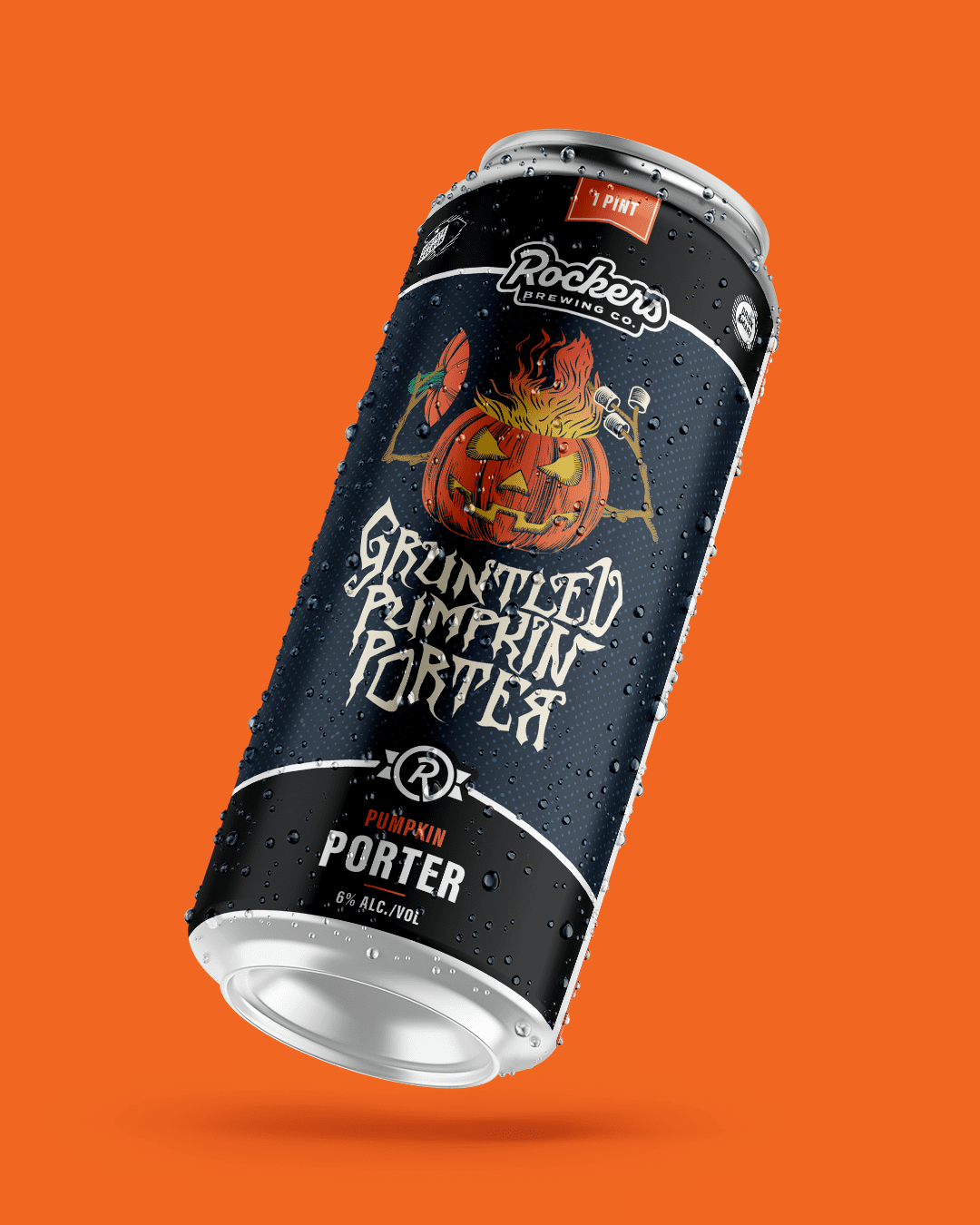
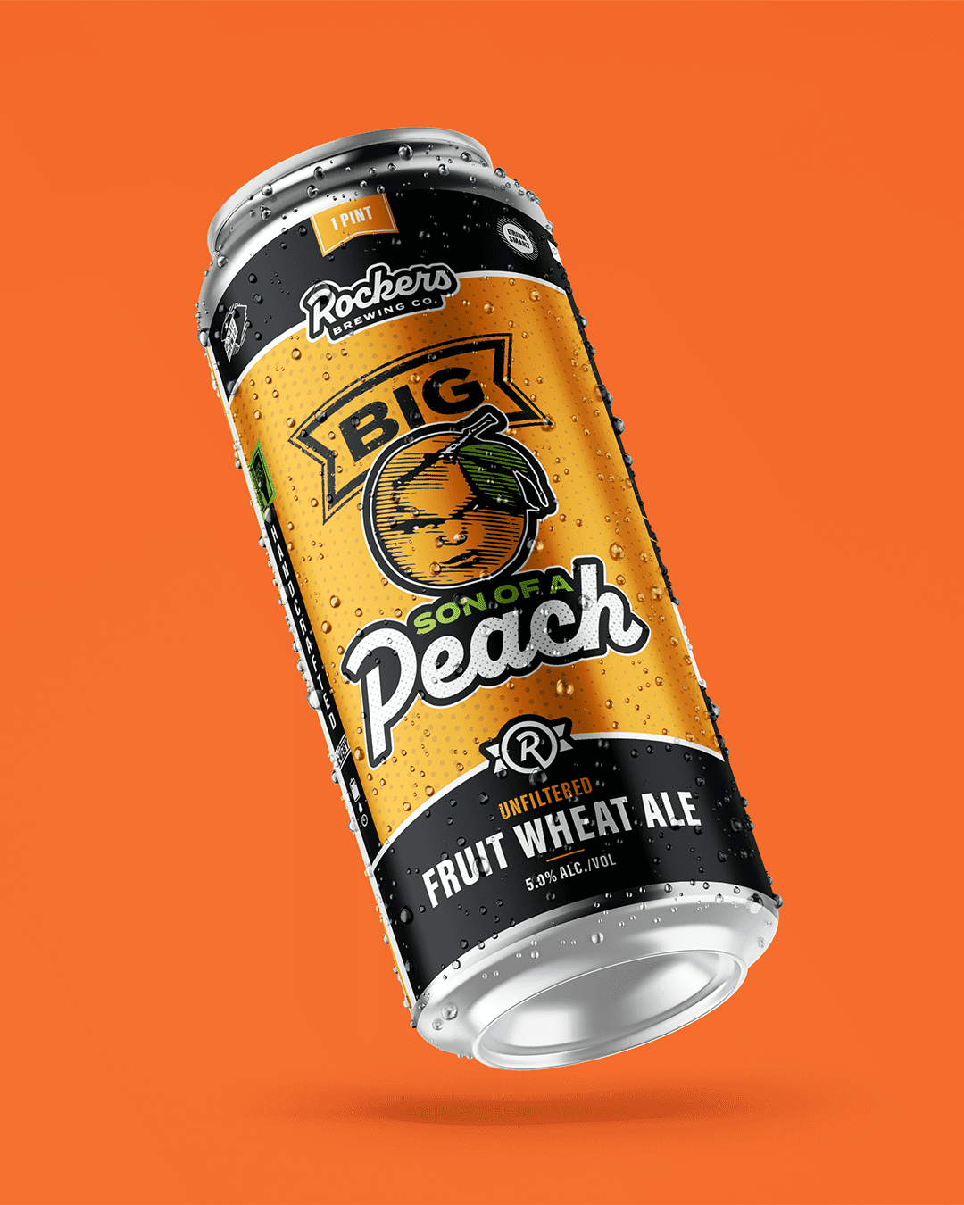
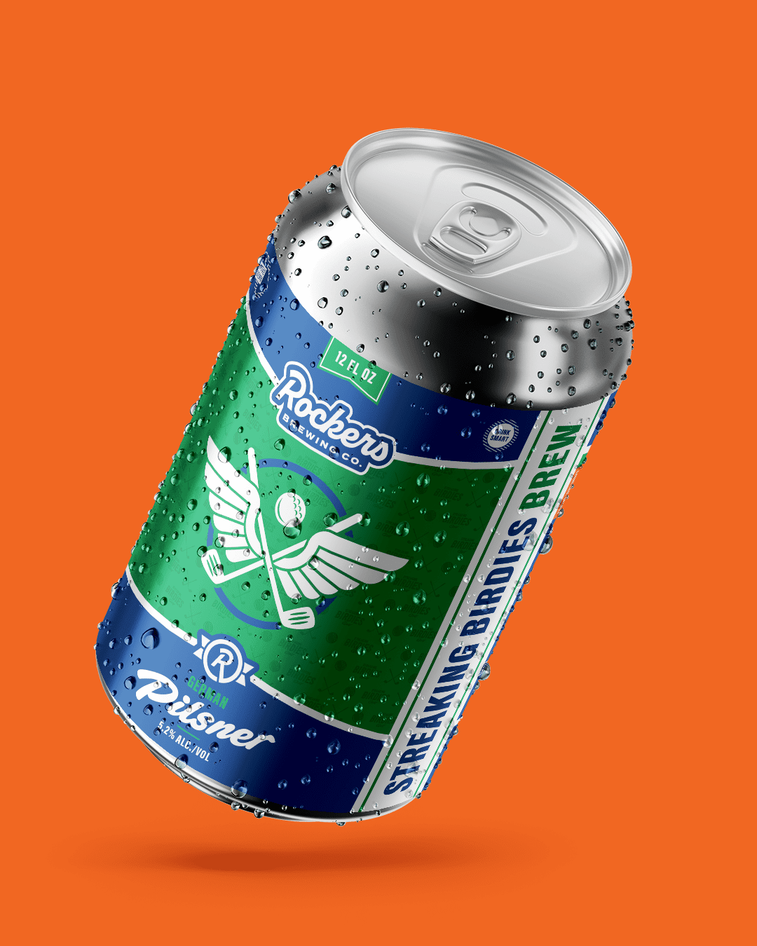
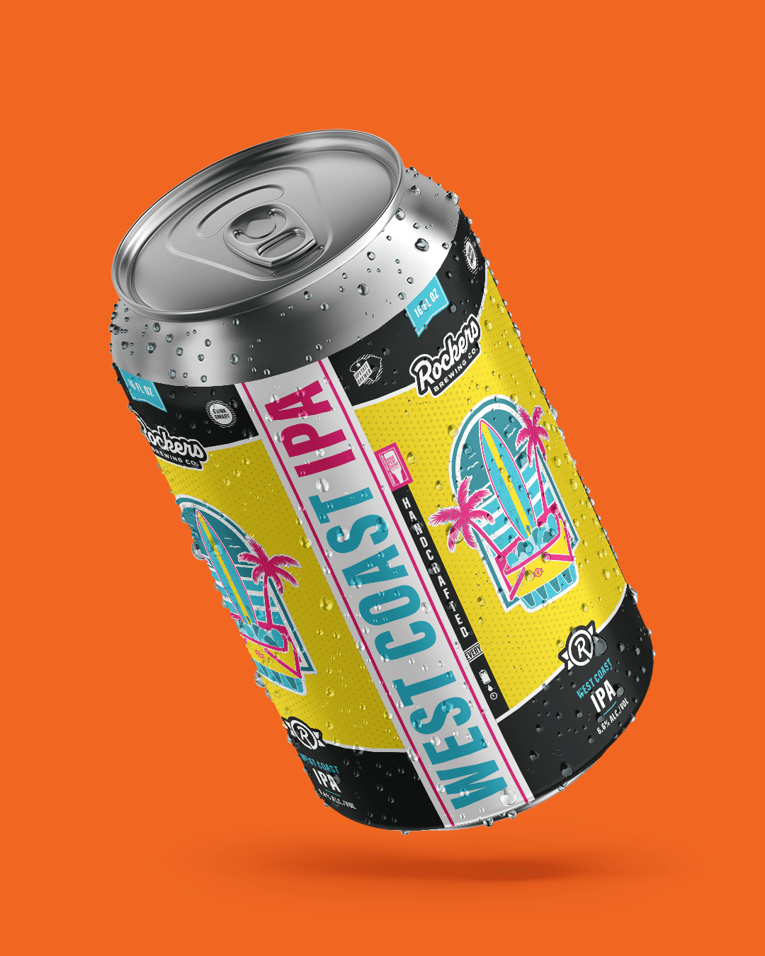
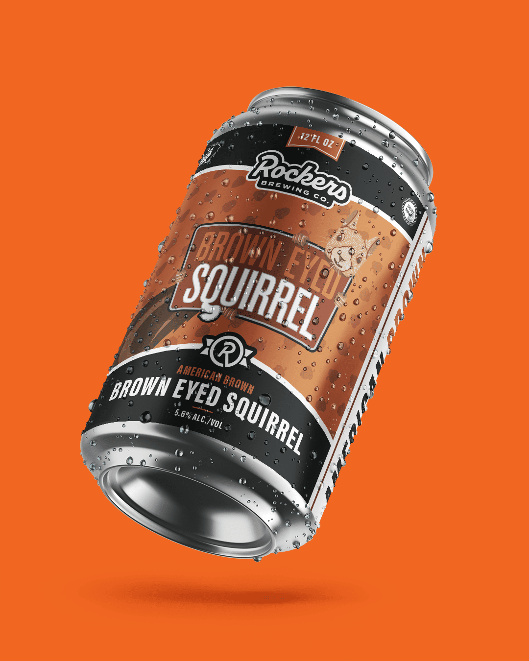
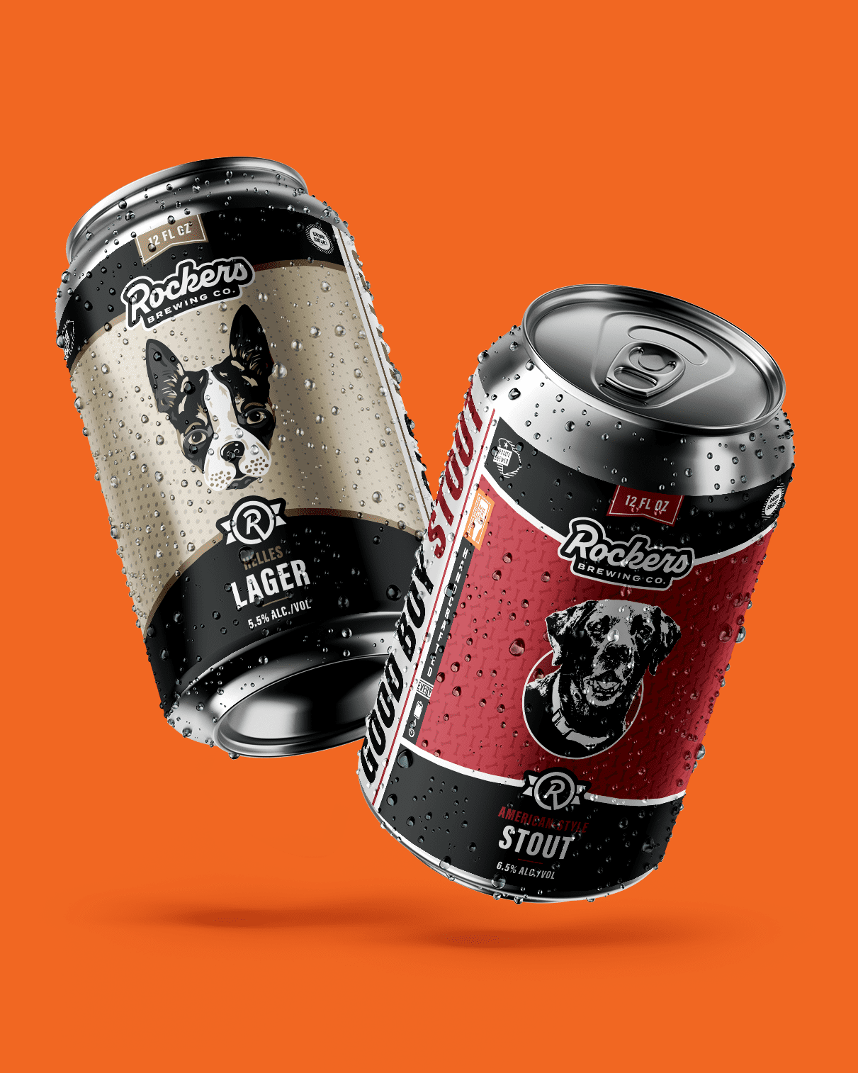
In the craft beer world, your brand has about three seconds to make an impression from six feet away. For Rockers Brewing Co., we focused on creating a “shelf-dominant” look that uses retro charm to cut through the noise of over-designed labels.
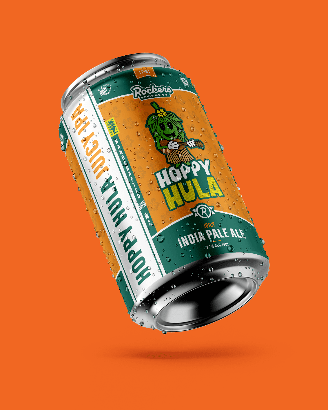
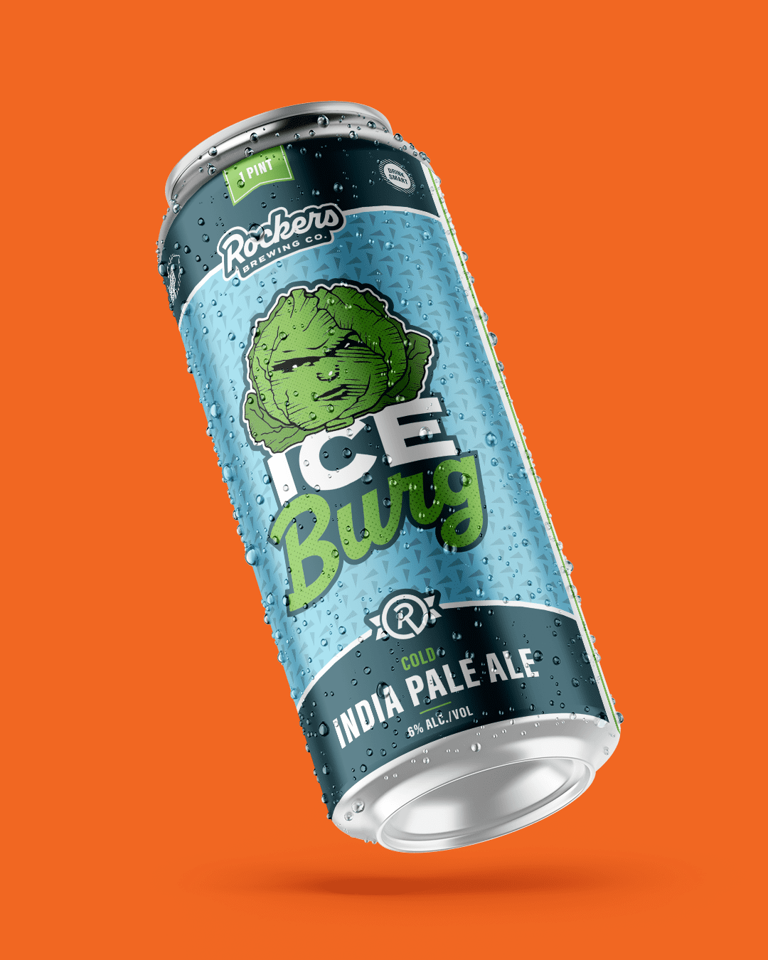
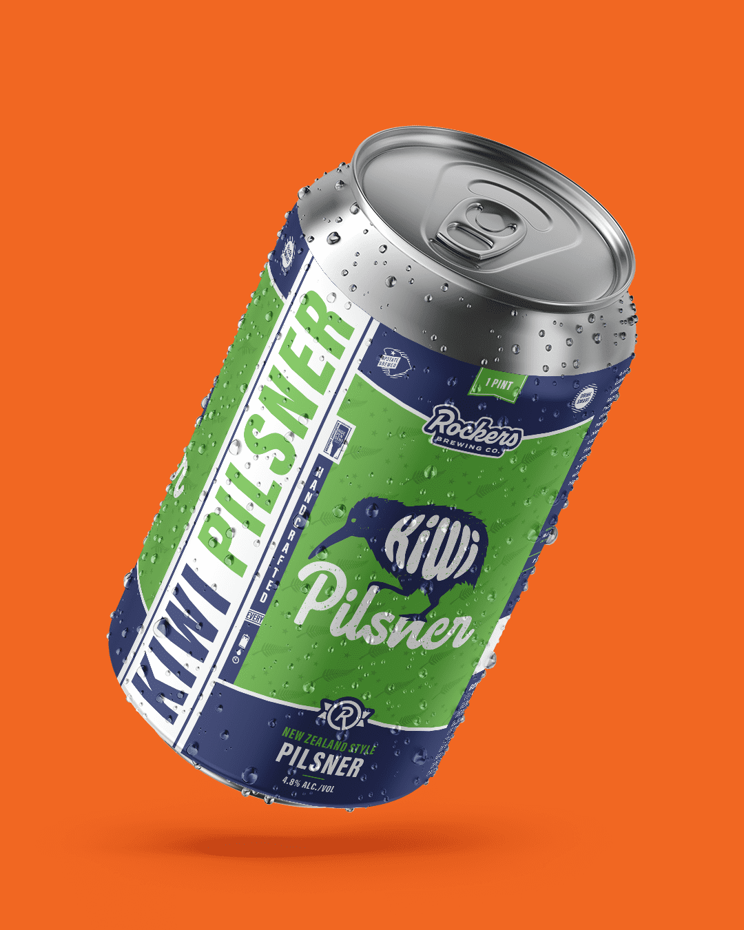
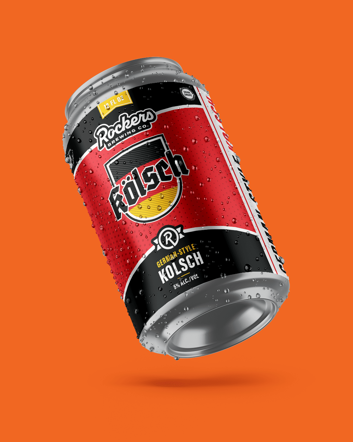
- Consistent Visual Anchor: We established a uniform layout for the new logo and brand elements. Whether it’s a staple IPA or a seasonal release, the consistent structure makes it easy for loyal fans to find “the Rockers look” in any store.
- Vibrant Color Blocking: We ditched muted tones for high-energy color combinations. These palettes don’t just look good; they signal the specific “flavor profile” of the beer, helping the consumer make a split-second buying decision.
- Format Flexibility: Modern breweries need designs that scale. We engineered this system to look equally impactful on a standard 12oz can as it does on a 16oz “tall boy,” ensuring the brand identity remains uncompromised across their entire production line.
This rebrand moves Rockers Brewing Co. into a new era of growth. By combining a sense of nostalgia with professional, high-impact design, we’ve given them a visual toolkit that drives sales and reinforces their status as a standout player in the Southeast craft market. It’s fun, it’s legible, and most importantly, it’s built to move product.