
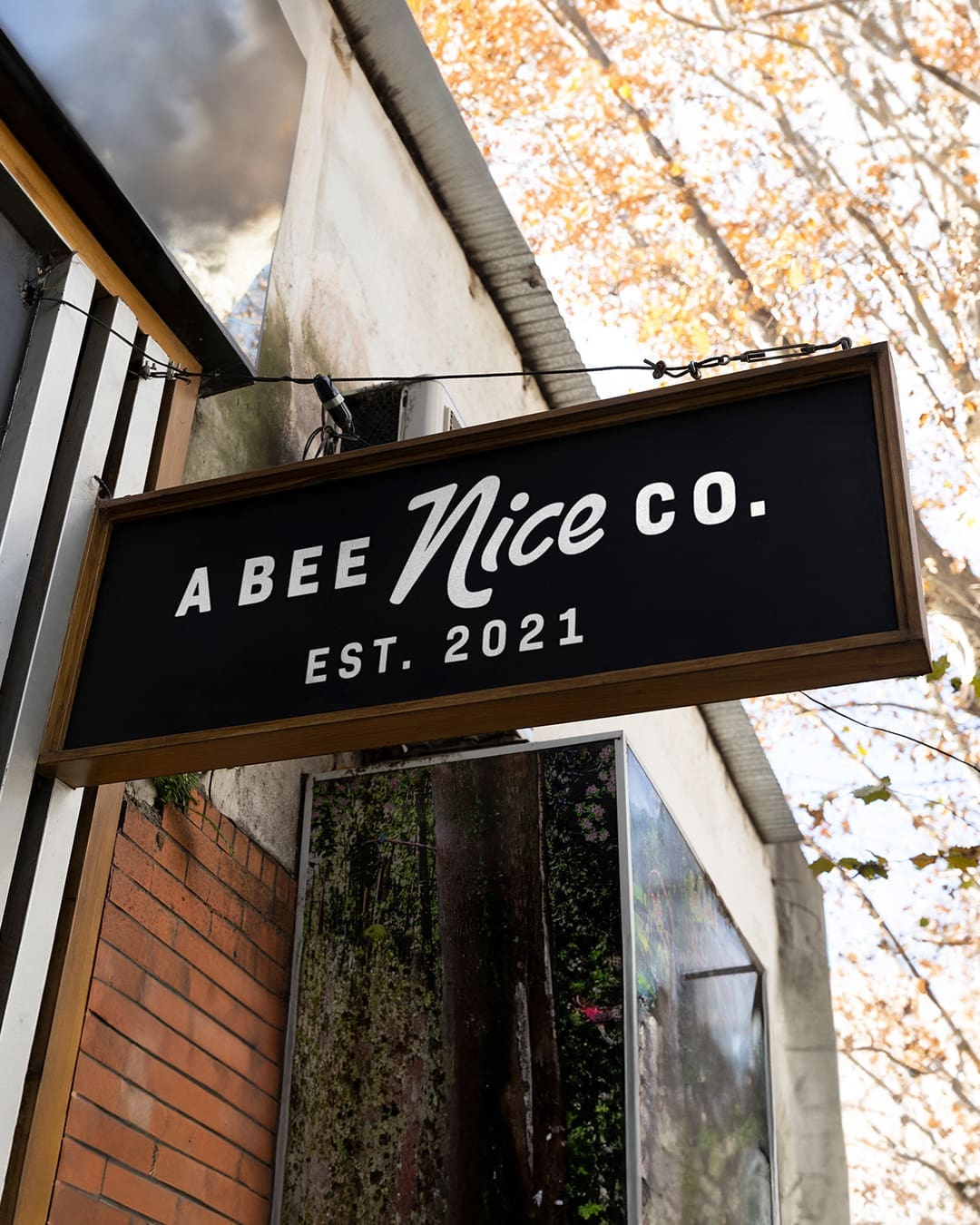
A Bee Nice Co. is an apparel brand built on a message of inclusion and community. As the company grew, they needed to move away from their original, literal bumblebee logo and transition toward an identity that felt more elevated and versatile. The objective was to honor the brand’s history while creating a professional mark that could stand on its own in the competitive apparel market.
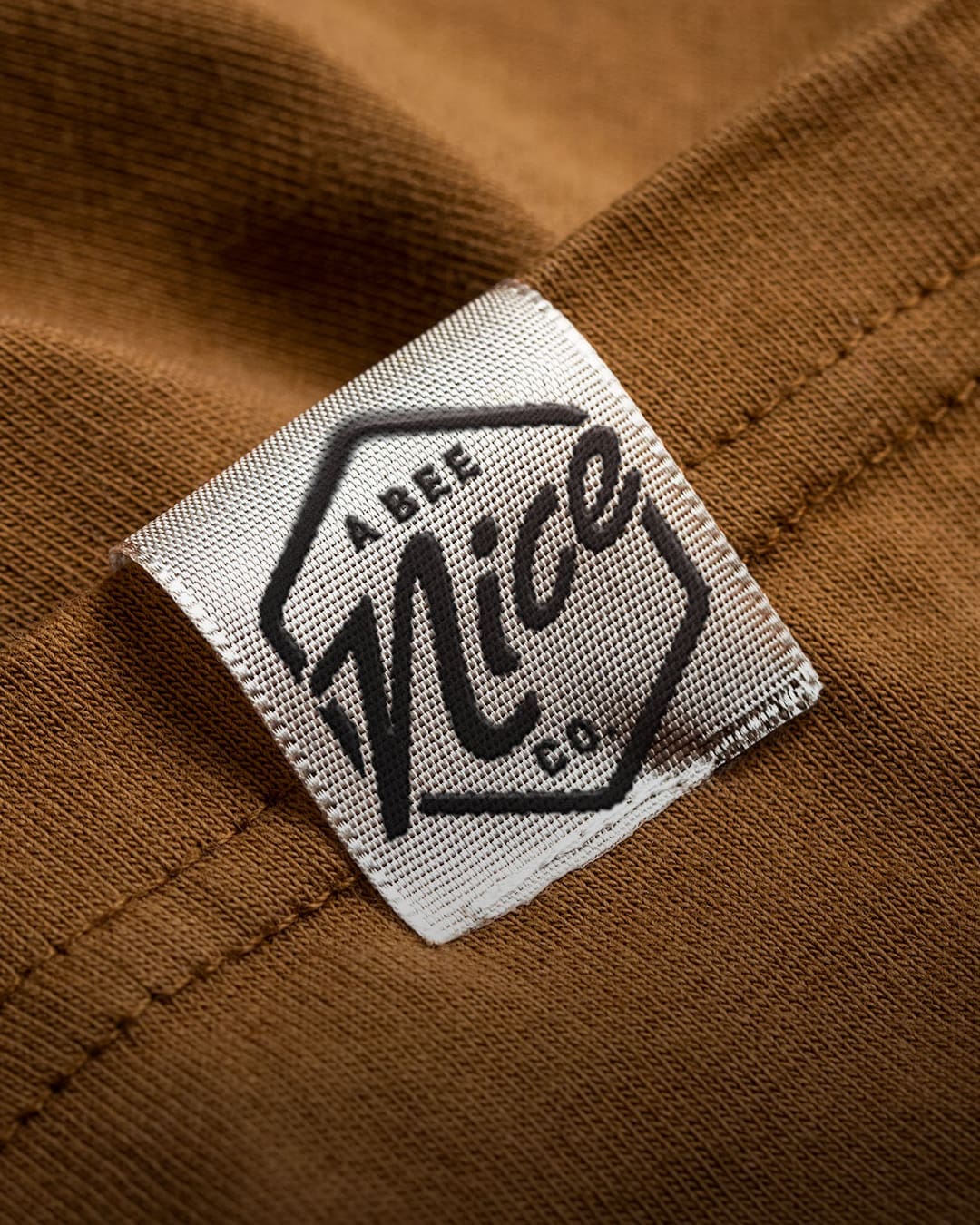
- Abstract Brand Narrative: We replaced the illustrative bee with a geometric honeycomb shape. This acts as a subtle reference to the brand’s roots without relying on a literal character, allowing for a more sophisticated aesthetic.
- Typography-Forward Design: By focusing on a bold, custom wordmark for the word “NICE,” we gave the brand’s core value more visual weight. The design is clean, confident, and easily legible at any scale.
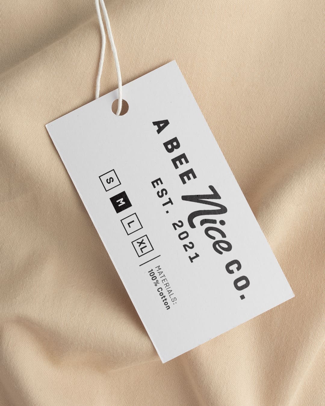
- Apparel-Ready Versatility: A primary requirement was ensuring the logo performs well across various production methods. The new system is optimized for everything from small hem tags and embroidery to large-scale screen printing and digital assets.
The updated identity helps the brand appeal to a wider audience while staying true to its original mission. By simplifying the visual elements, we’ve provided A Bee Nice Co. with a scalable system that works across print, web, and packaging. The final result is a professional foundation that lets the brand’s message of positivity take center stage.