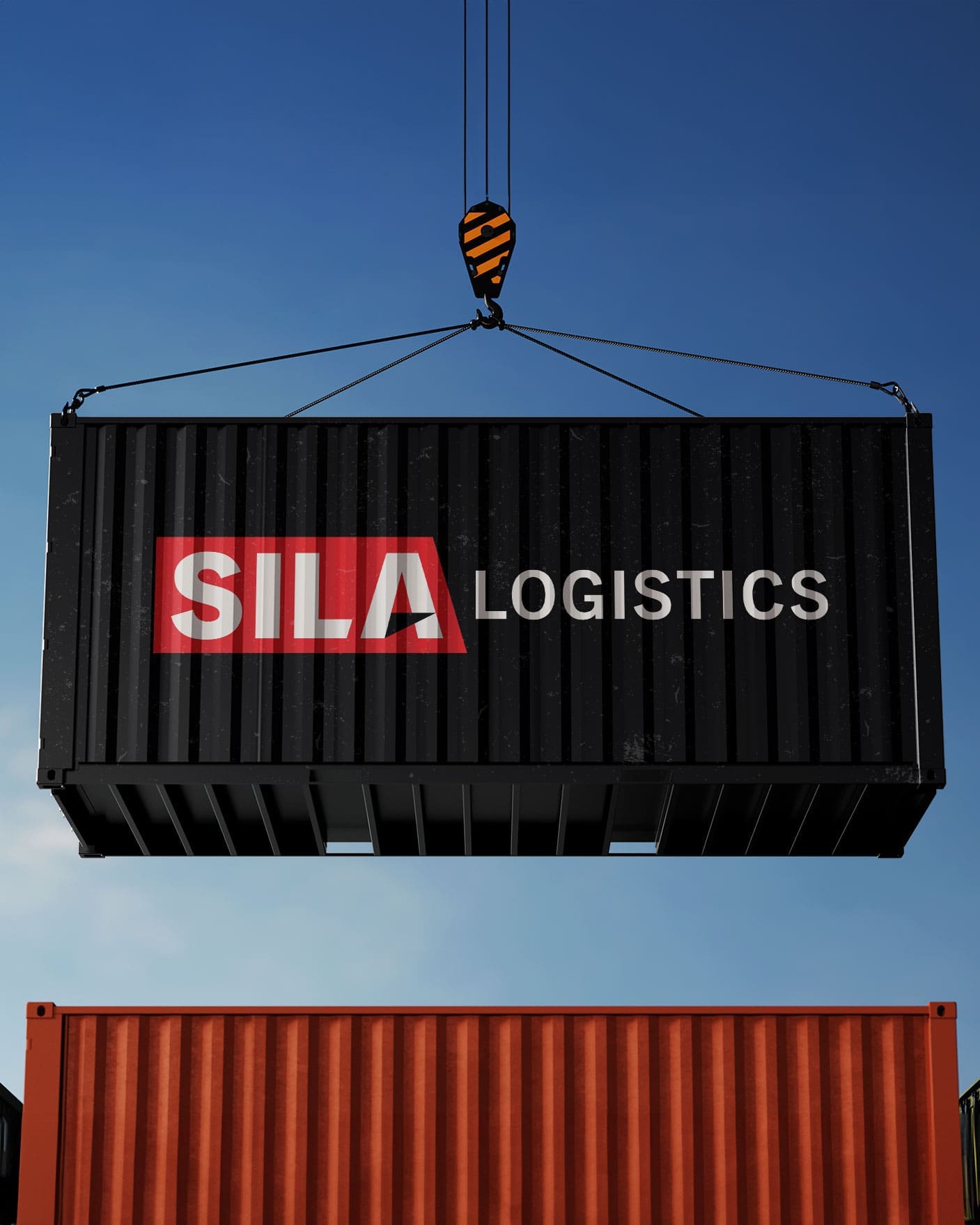
Logo Design for Sila Logistics

A high-contrast, industrial-grade logo engineered for maximum legibility on the move.

The Challenge

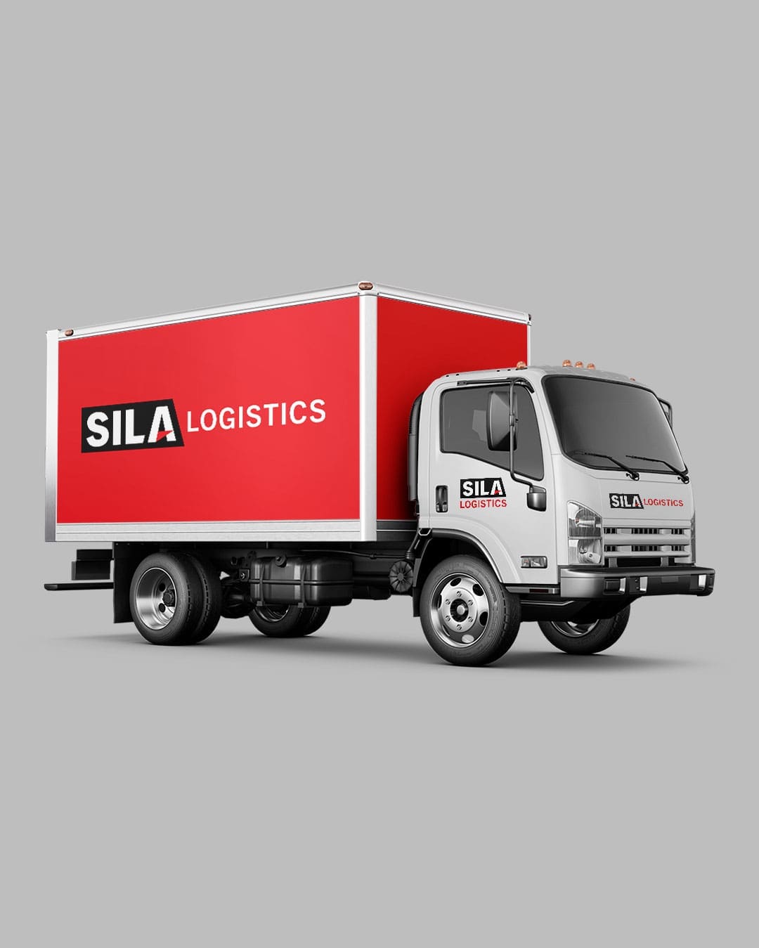
Logistics branding has a specific hurdle: the logo is usually seen at 70 mph on the side of a trailer. Sila Logistics needed a mark that was professional and modern, but primarily one that wouldn’t “blur” or become illegible when viewed from a distance on the highway.

The Solution

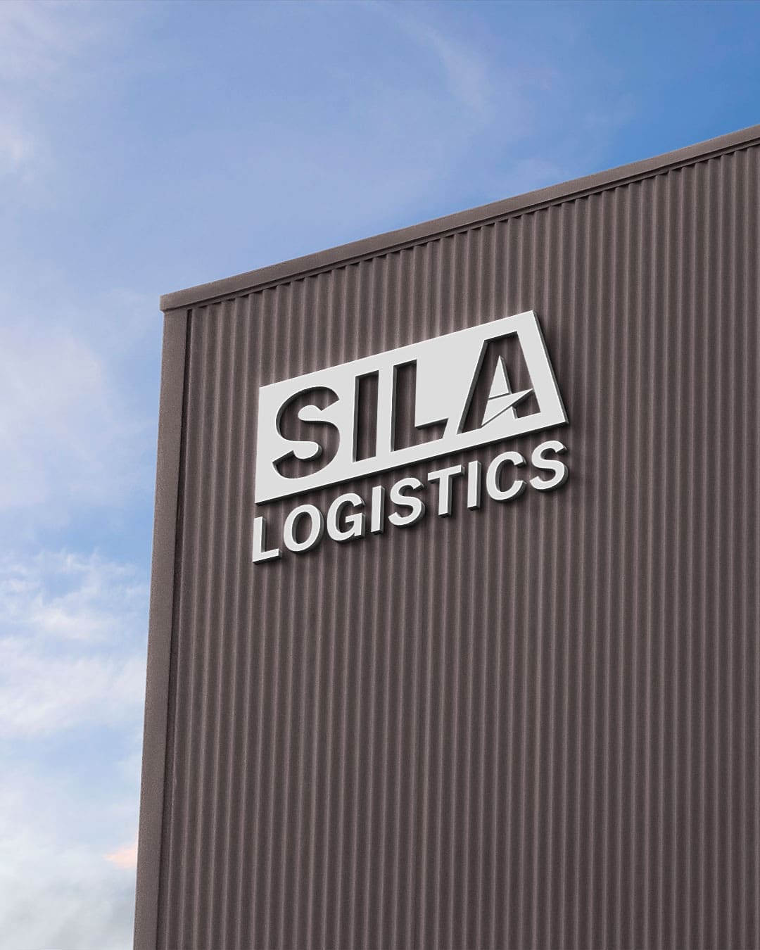
We focused on high-contrast visuals using a bold red and black palette. By pairing sleek, linear elements with a clean sans-serif typeface, we ensured the brand remains “loud” and recognizable across a fleet of trucks. The design emphasizes motion and stability, fitting for a company responsible for heavy-duty transit.

The High-Speed Handshake

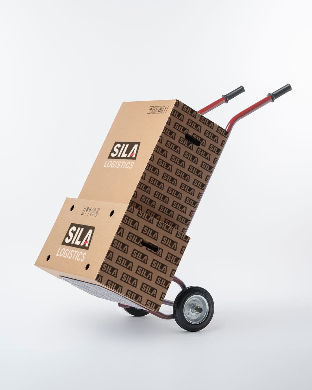
In the logistics industry, your truck is your biggest marketing asset. For Sila Logistics, the goal was simple: create a logo that looks as good on a business card as it does on a 53-foot trailer.

  • High-Contrast Palette: We stuck to a classic red and black scheme. It’s an aggressive, professional combination that demands attention against both asphalt and sky.
  • Designed for Legibility: We used a heavy, clean sans-serif font to ensure the company name is readable in a split second. No clutter, no unnecessary flourishes—just a clear, bold identity.
  • Modern Lines: The subtle use of sleek lines suggests speed and precision, reflecting the core values of a reliable logistics partner.

The result is a functional, no-nonsense logo that gives Sila Logistics a professional edge every time their trucks hit the road.

Elevate your brand with ADG.

For brands with the vision but needing the muscle, we serve as your fractional marketing department, plugging into your team to provide high-level strategy and digital platforms that command attention.